Sapphire UI (React UI)
THIS FEATURE IS CURRENTLY IN BETA
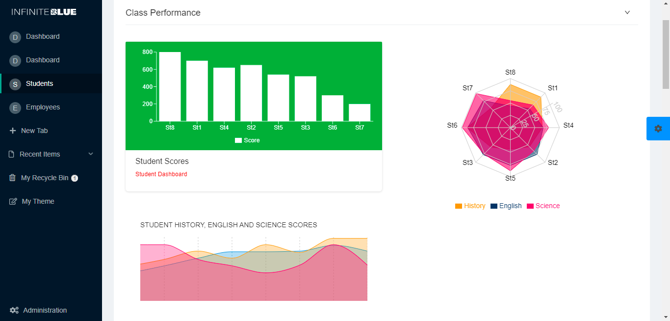
The Infinite Blue Platform, prior to 6.0 release, used the Kendo UI engine, by default, to render the App UI. The Kendo engine uses Kendo UI Framework based on JQuery. At par with the current industry standards, Platform has now evolved and implemented REACT UI engine that can be used to render the same App using REACT Framework. Both, Kendo and REACT engines are currently available simultaneously. The following image displays how intuitive an application page can be customized using Sapphire UI.
With an easy-to-use toggle button, switching from one UI to another is possible at any time without any impact on the Application or Meta data. Thus, users now have an option to pick the UI framework of their choice. The React engine uses Ant Design library to a large extent but also has widgets from multiple other libraries.
Trying Sapphire UI
The following section briefly lists outs the most evident differences between the existing Kendo Engine and React Engine (Beta).
-
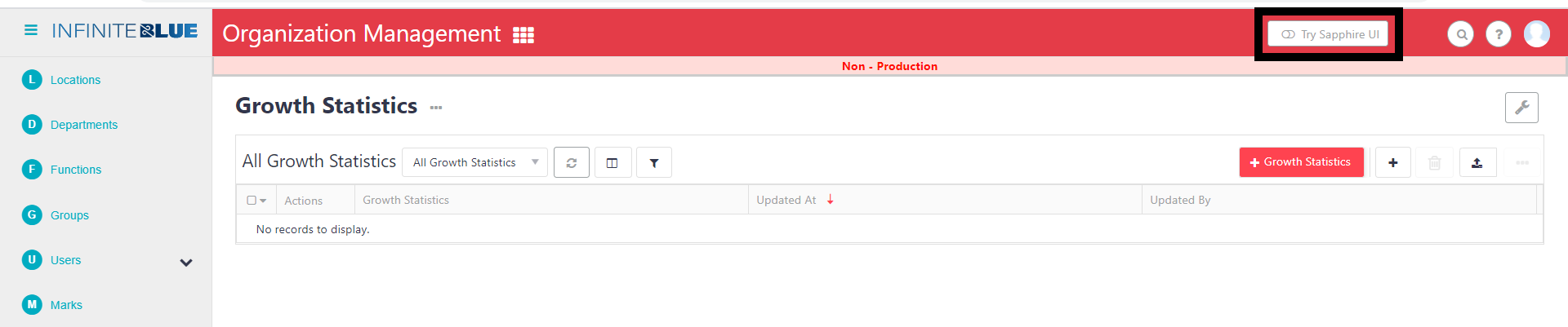
Try Sapphire UI: Users can switch to the React Beta UI framework by clicking Try Sapphire UI toggle at the top right of the page view. This action can be performed on any Platform page of the instance. This functionality is governed by ShowNewBetaUITryoutLink shared property.
-
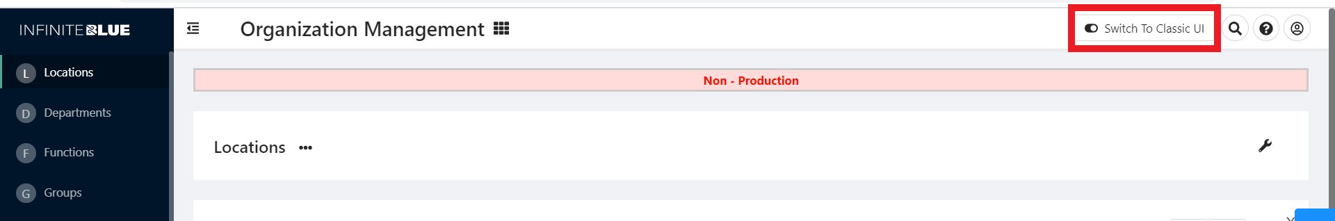
Switch to Classic UI: For any reason, if a user wants to switch back to the Classic UI framework, clicking Switch to Classic UI toggle at the top right of the page view returns the page components to the Classic UI. This action can be performed on any Platform page of the instance.
-
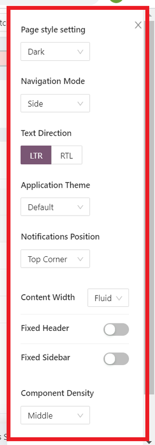
App Preview: Sapphire UI enables a user to preview and change properties such as Page Style, Navigation Mode, Text Direction, Application Theme, etc. at the application level, by clicking App Preview from the Application Switcher Menu. For more information, see App Preview and App Settings - Sapphire UI.
-
App Settings: The Theme can also be changed by navigating to App Settings. Since Sapphire UI supports custom themes, these themes also appear in this drop-down list as opposed to Classic UI. For more information, see App Preview and App Settings - Sapphire UI.
-
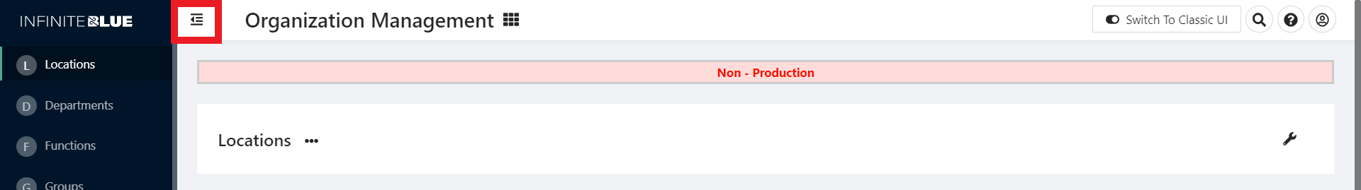
Collapse/Expand Sidebar: To collapse or expand the left sidebar, users can click the Collapse/Expand icon at the top left of the page.
-
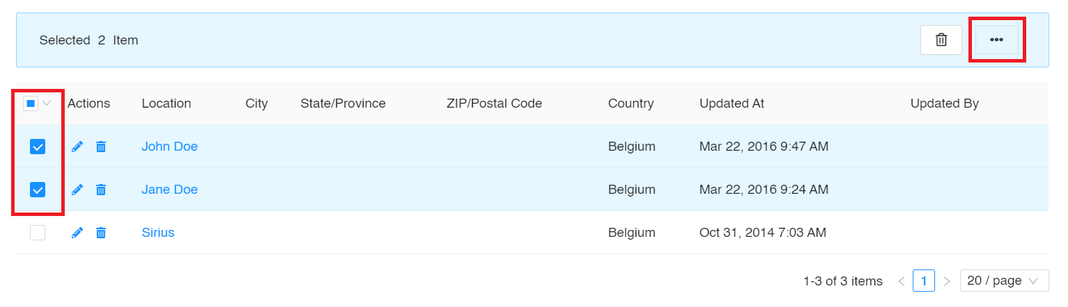
More: The More (ellipsis) action button appears and is activated in the Sapphire UI only when at least one record-checkbox is selected. This action enables a user to Tag, Convert, Merge, Find Duplicates, etc.
-
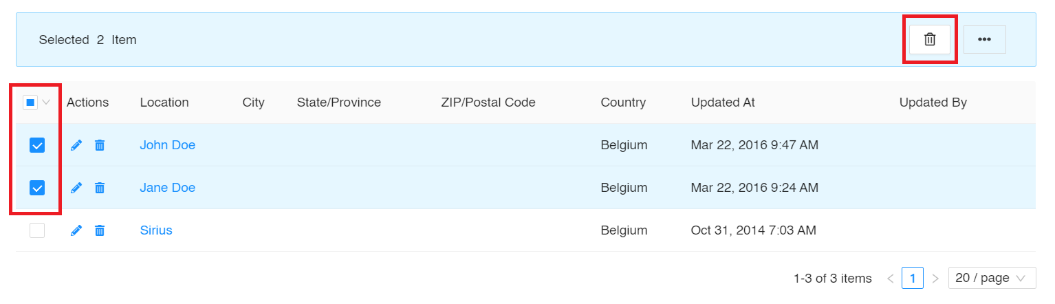
Delete: The Delete button appears and is activated in the Sapphire UI only when at least one record-checkbox is selected. This action enables a user to delete one or more records by (multi) selecting them.
-
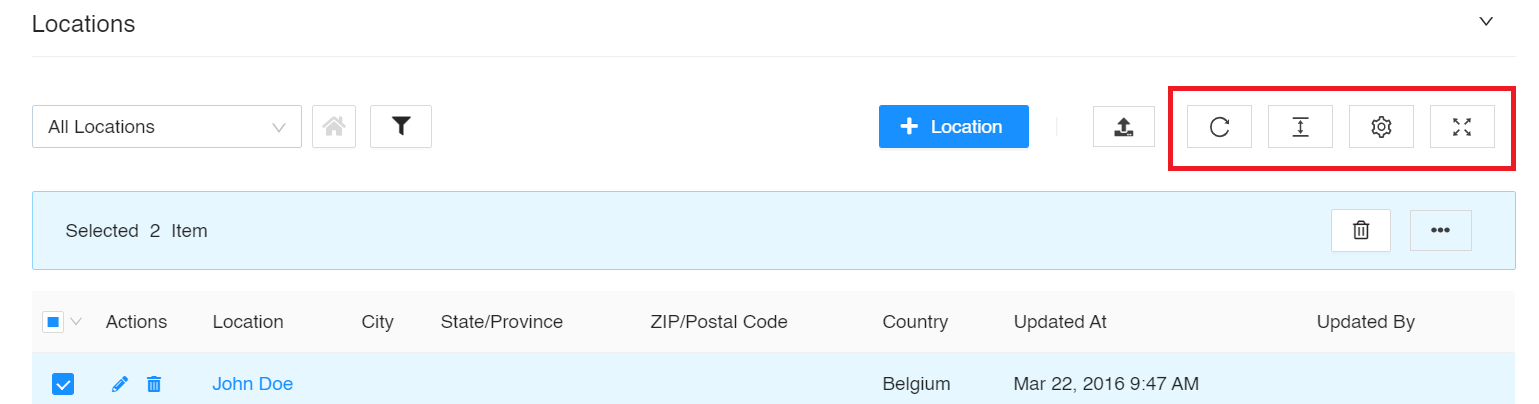
Additional UI elements in the React UI: The Refresh, Density, Column Display, and Full Screen options can be used to perform the following actions:
-
Refresh - To refresh the list of records.
-
Density - To set the height of the row as Larger, Middle, or Compact.
-
Settings – To select the columns to view from a menu that includes Actions, Locations, City, etc.
-
Full Screen - To view the list of records in the full screen mode of the device in use.
-
To configure widgets on Sapphire UI, see UI Configurator.