UI Configurator
THIS FEATURE IS CURRENTLY IN BETA
The UI Configurator is a simple UI Widget Mapper that represents an object's data in rich UI widgets. It also enhances the appearance and performance of the Platform’s UI components based on the REACT JS architecture.
For example, users can design an interactive dashboard using the UI widgets. By default, a set of widgets are readily available for use where the users can start mapping the widgets with any object’s view data and record specific data.
Working with UI Configurator
This UI configurator is accessible from the App Switcher. In order to access it, the UI toggle button must be set to Sapphire UI.
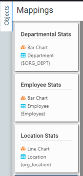
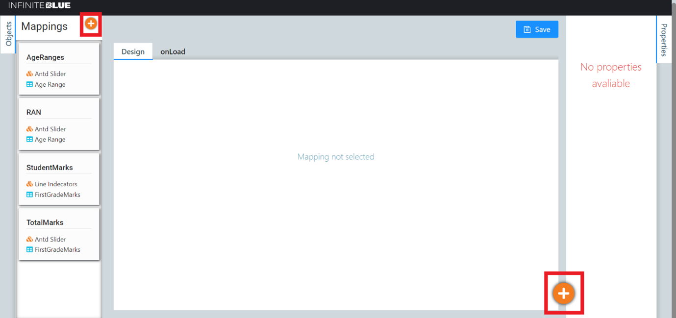
The left pane of the User Dashboard displays the objects that enables the user to add mappings. Each mapping has a unique name. Each mapping is linked with an object view or record which can be mapped with any widget available
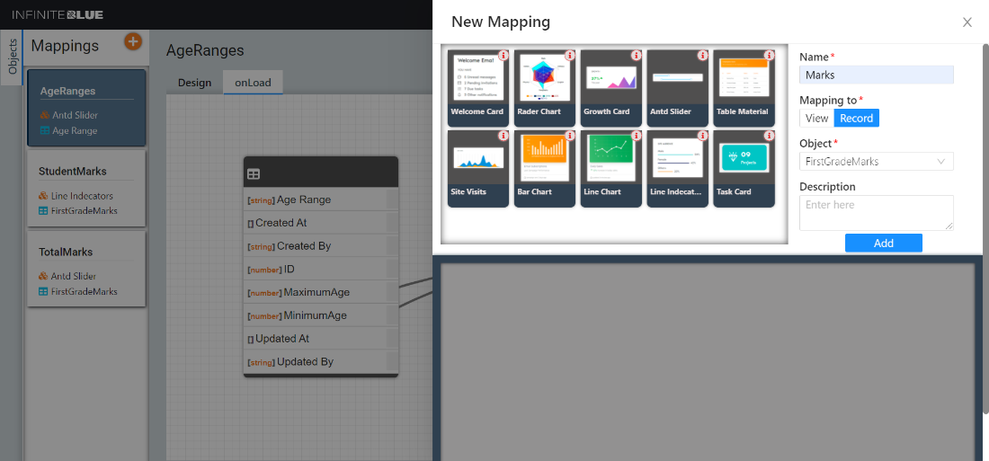
To add a mapping, click the + icon
A New Mapping pane slides from the right.
-
Select the visual widget for the mapping.
-
Enter the Mapping Name. This needs to remain unique across the Platform.
-
Select Record/View under Mapping to, and then choose the Object and View against this mapping.
-
Enter a description for this mapping.
-
Click Add to complete the New Mapping addition.
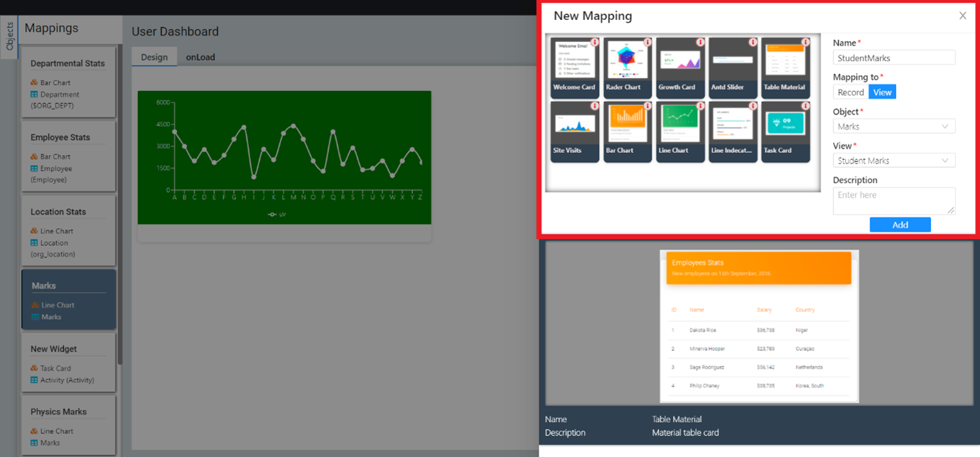
The newly added mapping should be available in Mappings of the left Objects pane.
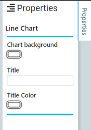
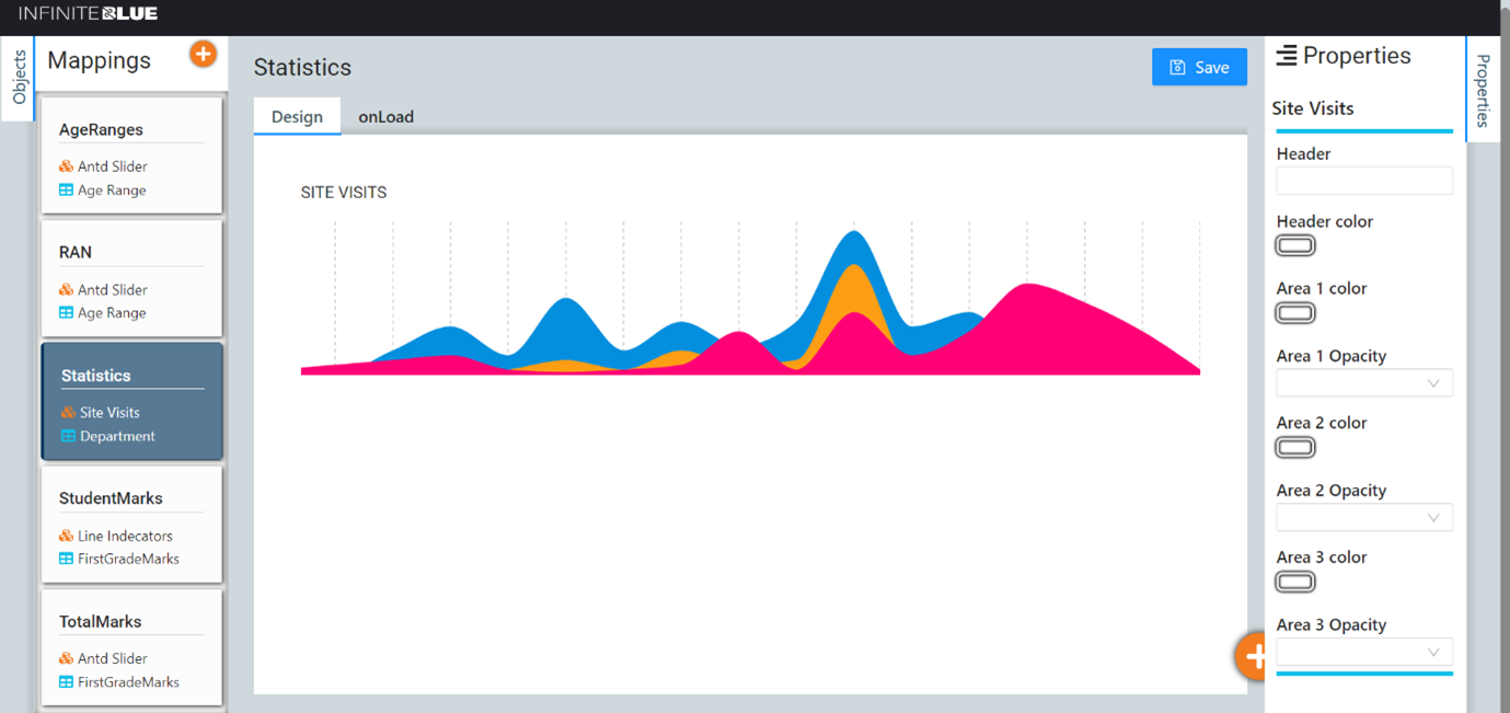
The right pane of the User Dashboard displays the properties of any selected object mapping/widget.
User Dashboard
The user dashboard comprises of two tabs - Design and onLoad. In case of Antd Slider widget mapping, there is an additional onChange tab.
Design tab
This tab is for a preview purpose only. To preview any mapping, click on any available mapping under Mappings of the Objects pane. The mapping is previewed on the Design tab based on the Sample Data for the widget and its properties accordingly.
OnLoad tab
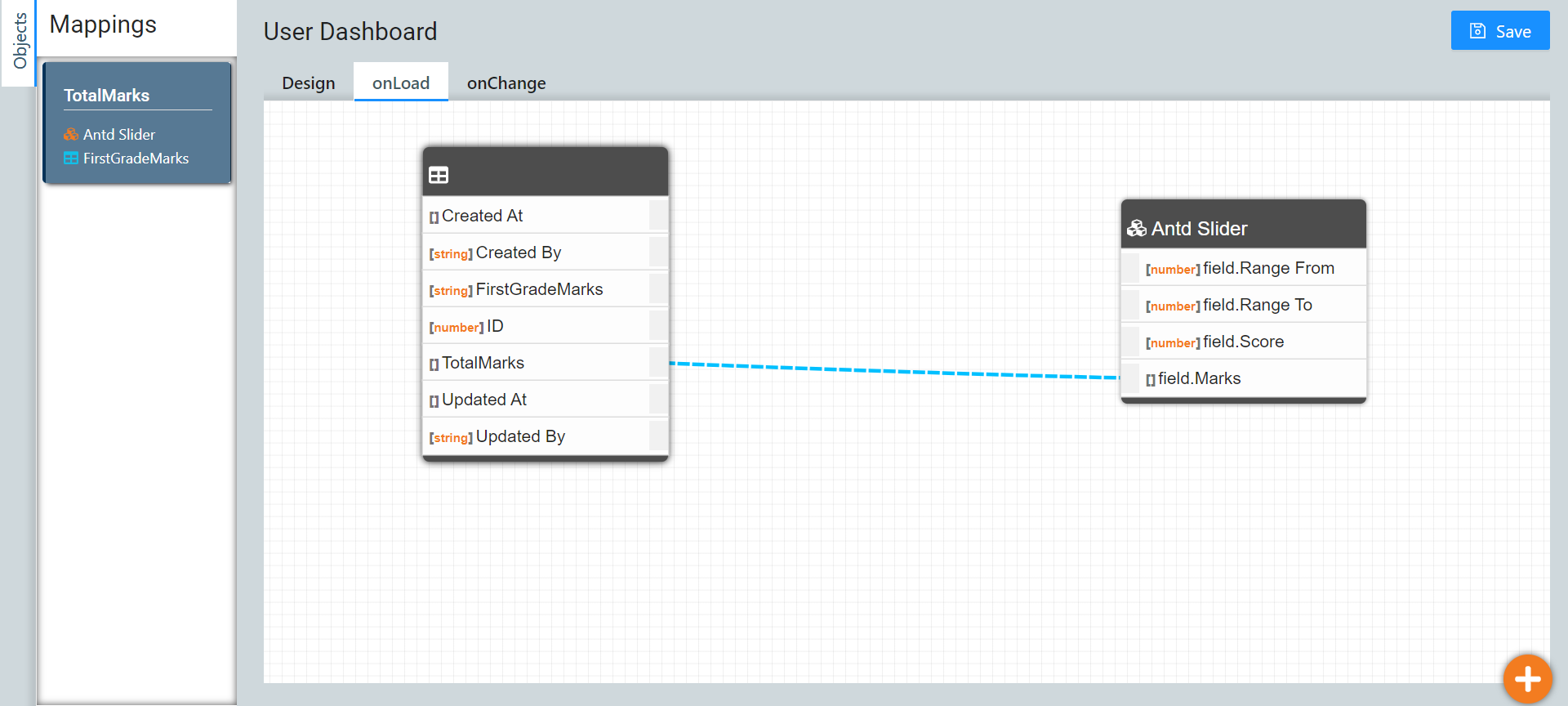
This tab enables the user to map the object’s view fields with the widget components. To map any widget, click on any available mapping under Mappings of the Objects pane. On the OnLoad tab, the user can start connecting the nodes between the view(s) of an object against the widget based on the requirement.
Note: The mapping lines appear as blue dotted lines if the mapping is done correctly.
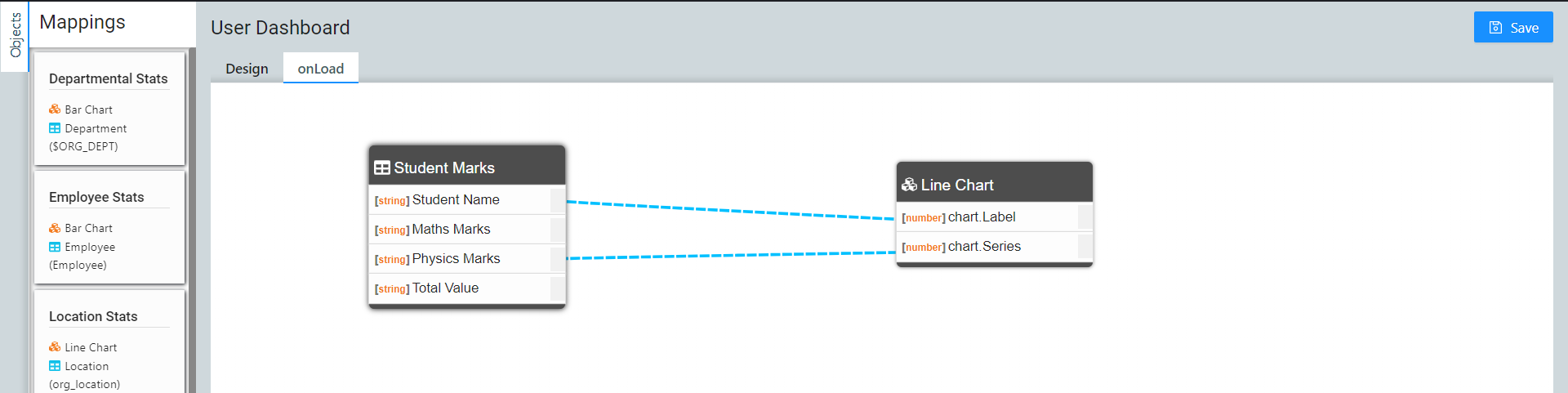
Click Save to save the mapping configuration.
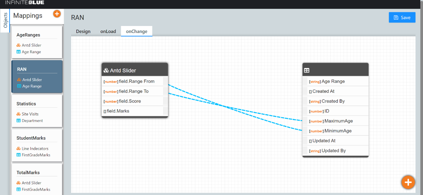
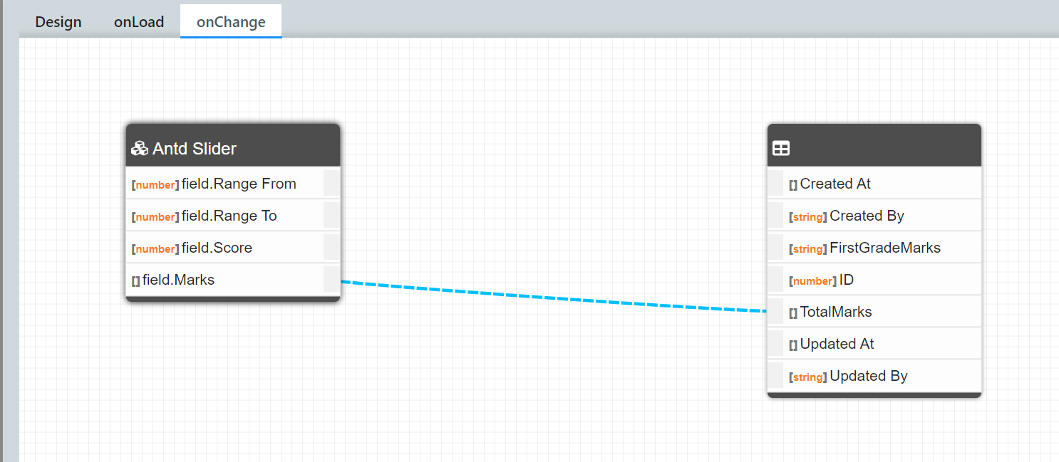
OnChange tab
This tab only appears in the case of Antd Slider widget mapping. Once the user renders certain data using the onLoad tab, if further changes are made then the output from these changes made is represented on the onChange tab. Hence the slider’s changed values are mapped to the fields.
Picklist Field – Antd Slider Widget Mapping
Picklist fields allow a user to select a field value from a list of values. For instance, in the screenshot below, we are creating a Picklist field named TotalMarks in the object FirstGradeMarks. This field can take up any one of the values specified in the Values text box. {D} is used for a default value, Medium in this case - however, this is not honoured in the case of Widgets. Click Save to save the field definition.
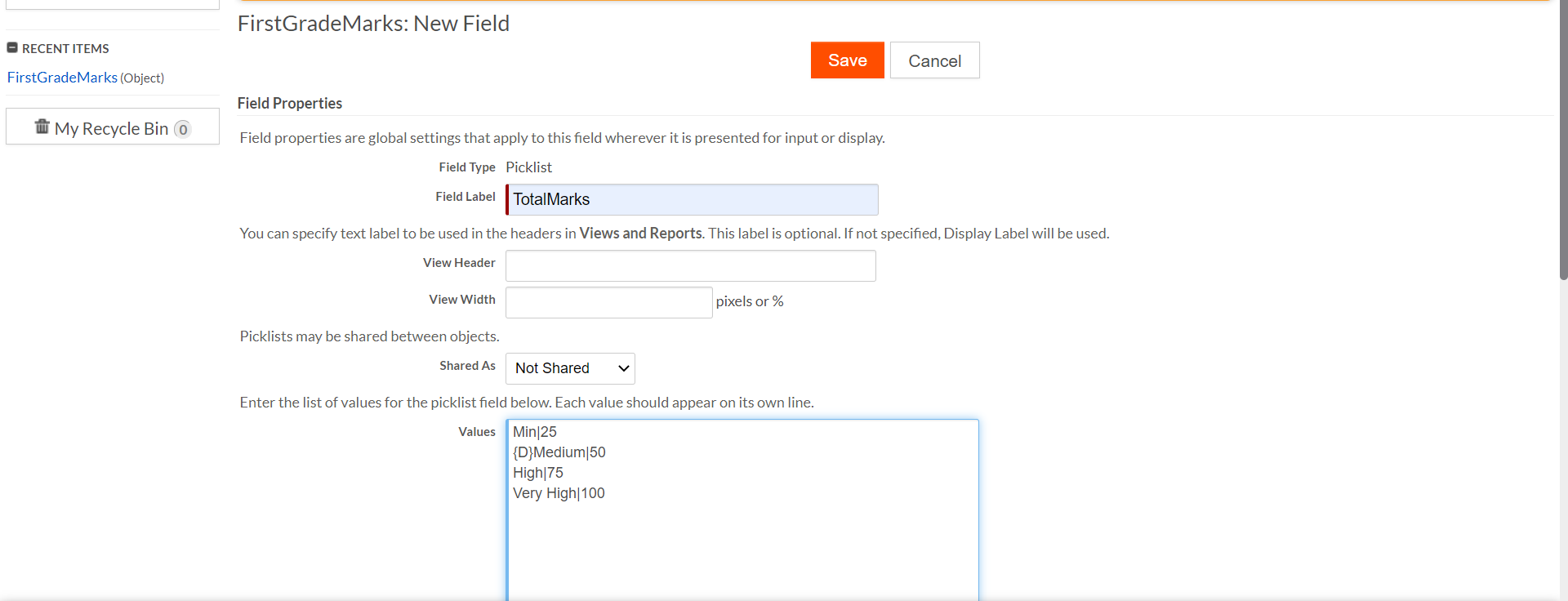
Note: Currently only numeric values are supported for the picklist code.
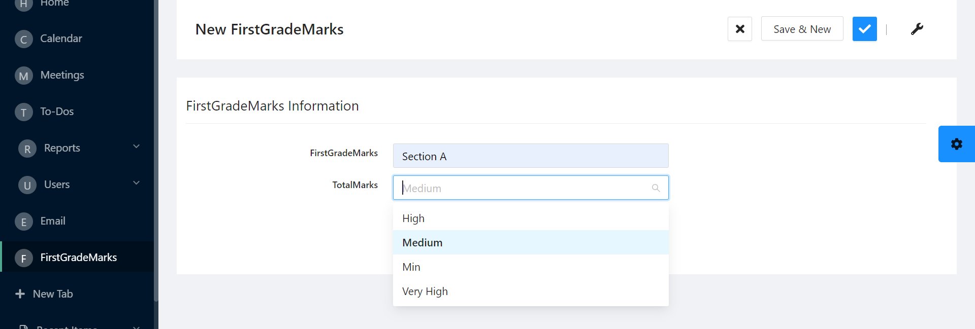
Hence, when a new record is created in this object, the Picklist field TotalMarks shows 4 values to choose from.
Similarly, we can create a new Antd Slider widget mapping in the UI configurator, by filling in the required details. Since this is a record specific widget, Record is selected under Mapping To.
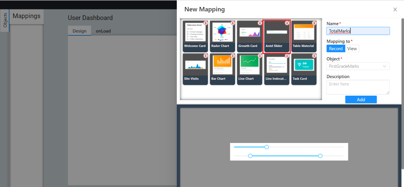
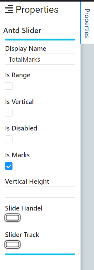
Add the Display Name and select the Is Marks checkbox under Properties.
Now map the Picklist field TotalMarks to the field.Marks array on the onLoad tab. Click Save to save the mapping.
On the onChange tab, map the value back to the picklist field.
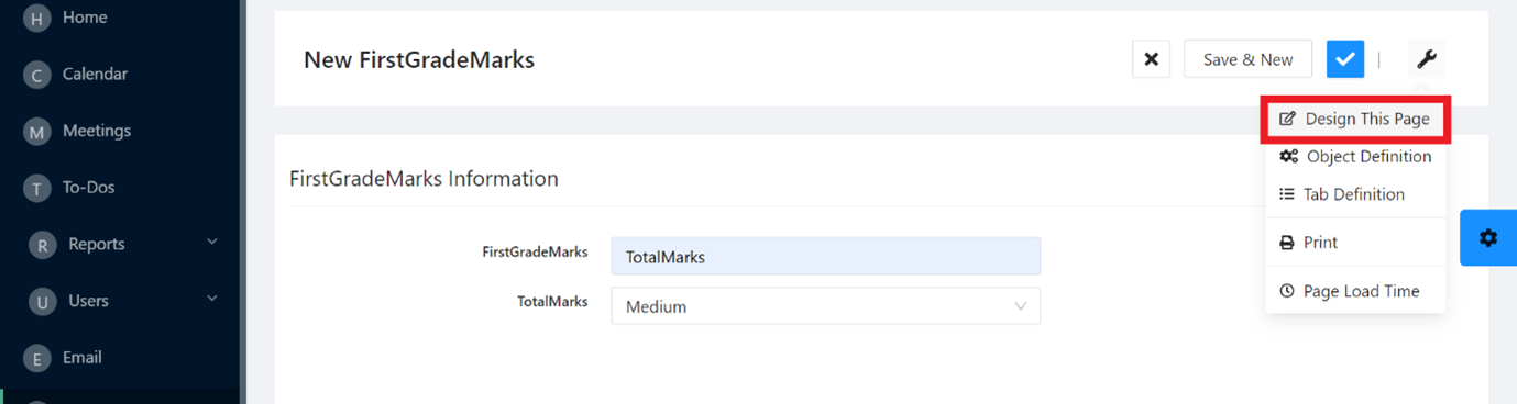
Page Designer
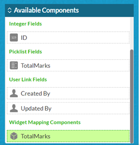
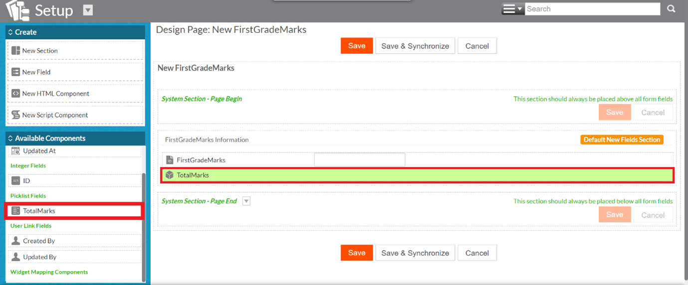
On completion of mapping/widget configuration, the newly added mapping becomes available on the list of Available Components under the Widget Mapping Components. The new mapping can be dragged and dropped when designing the New, Edit or View Record pages, using the Design this Page option. For more information to add components, see Editing pages.
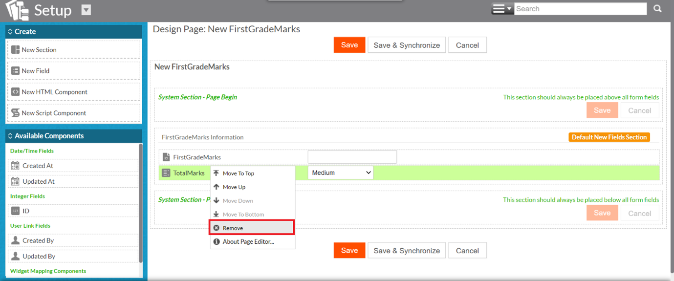
The widget mapping can then be added. The screenshot below displays the final arrangement of the New Record page – the picklist field TotalMarks has been removed, and the widget mapping TotalMarks has been added. Click Save to save this design.
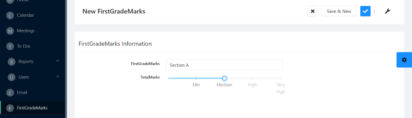
The widget mapping TotalMarks appears on the New Record page. Select a value on the slider and save it.
Range with Integer Fields – Antd Slider Widget Mapping
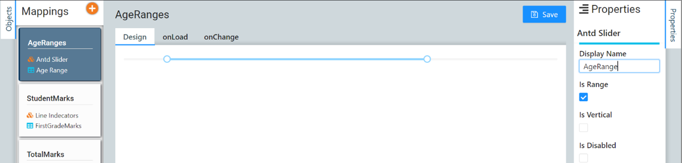
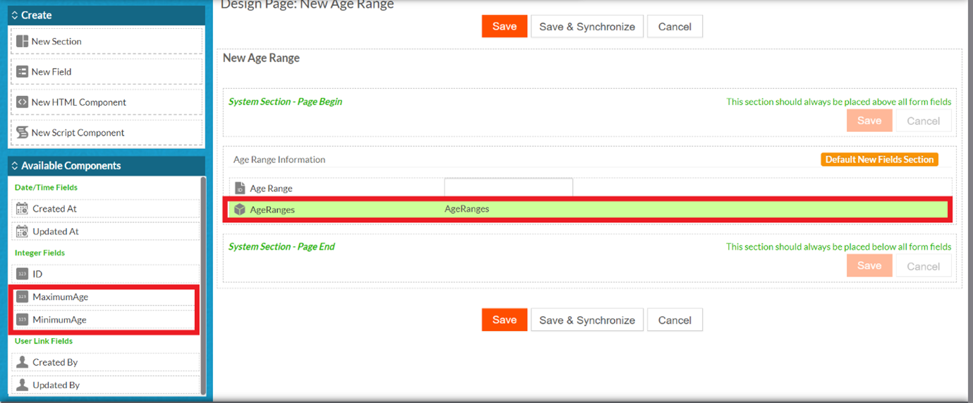
Similarly, a certain range of values can be represented on the slider. Since a range is defined by 2 values – one minimum limit and one maximum limit, we must first create 2 fields of Integer type. In this example, we have created 2 fields in the Age Ranges object.
In the UI configurator, create a new Antd Slider widget mapping, and select the Is Range checkbox under Properties. Click Save.
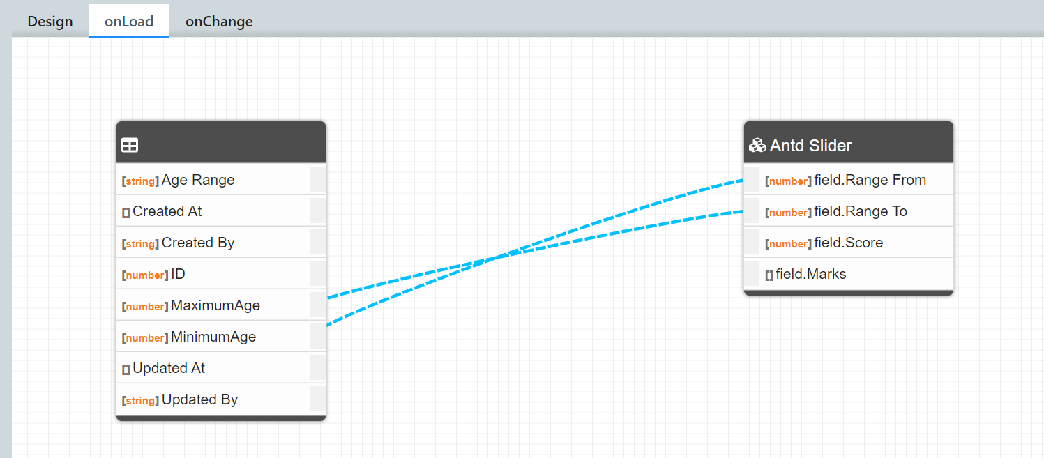
On the onLoad tab, Map the minimum limit field (MinimumAge) with Range From and the maximum limit field (MaximumAge) with Range To. Click Save
.
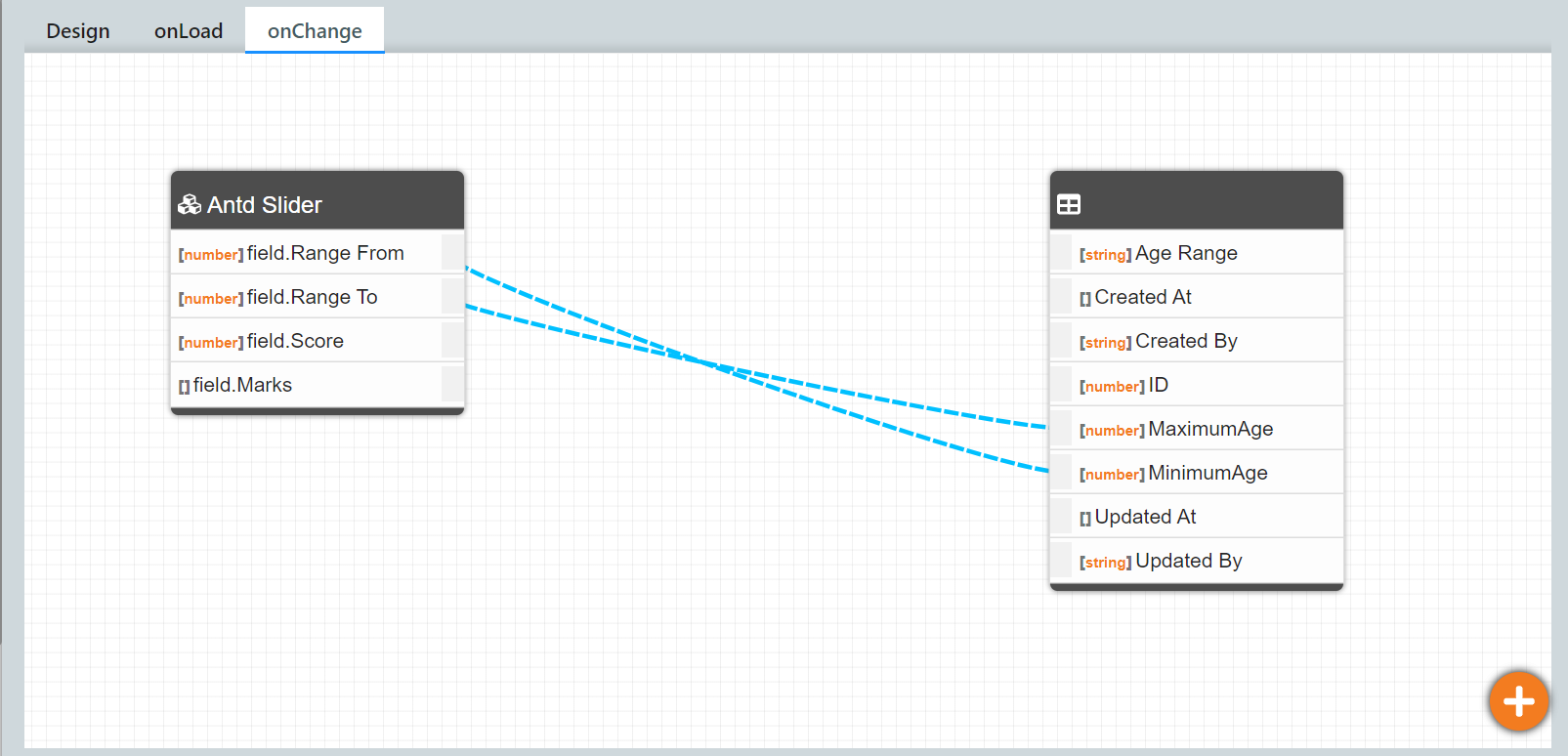
On the onChange tab, map the values back to the Integer fields. Click Save
Design the New Record page (New Age Range page in this case) such that the minimum and maximum fields are removed and the widget mapping component is added to it. The screenshot below displays the final arrangement. Click Save.
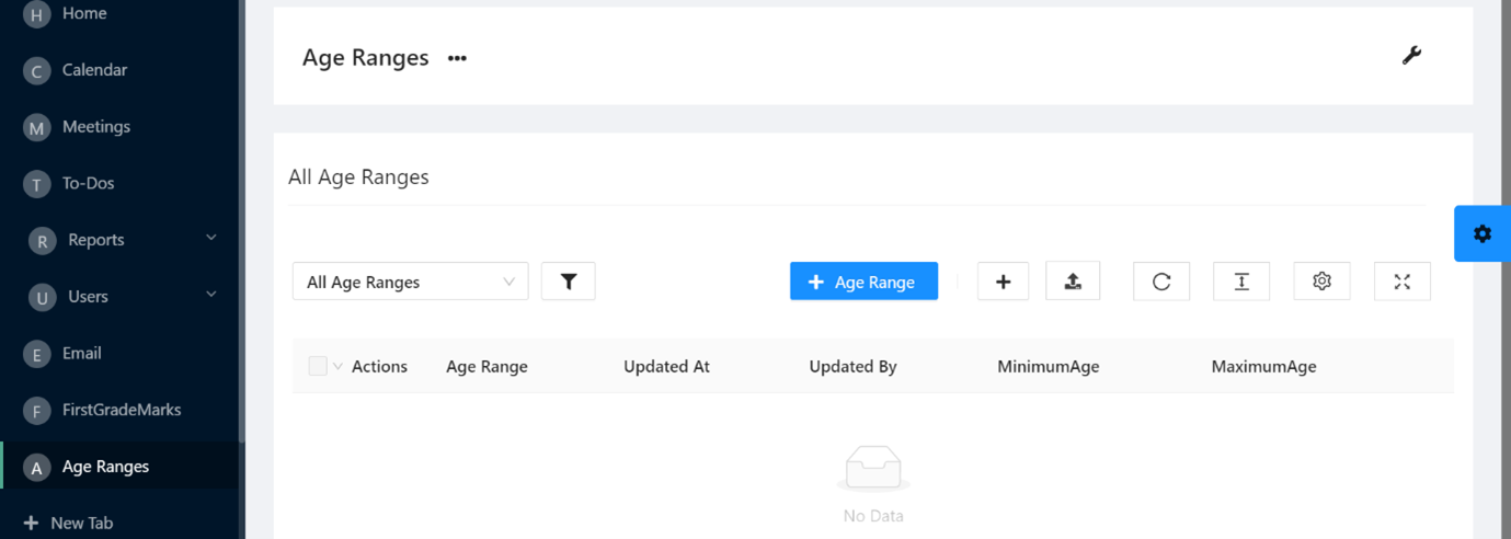
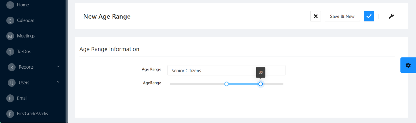
Hence the slider appears on the New Age Range page as shown below.
Views
With UI Widget Mapping, you can change views by selecting the required view from the available views in the respective object for mapping. The required view can be selected and loaded by clicking the Change View icon.
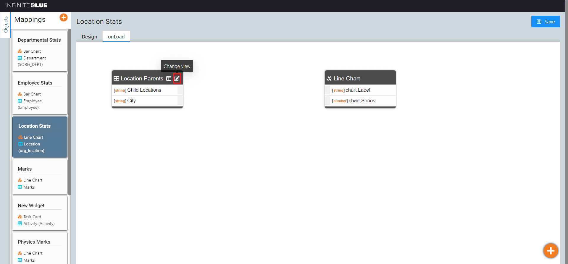
The Change View pop-up window appears. You can select the type of view you wish to load on the OnLoad tab.
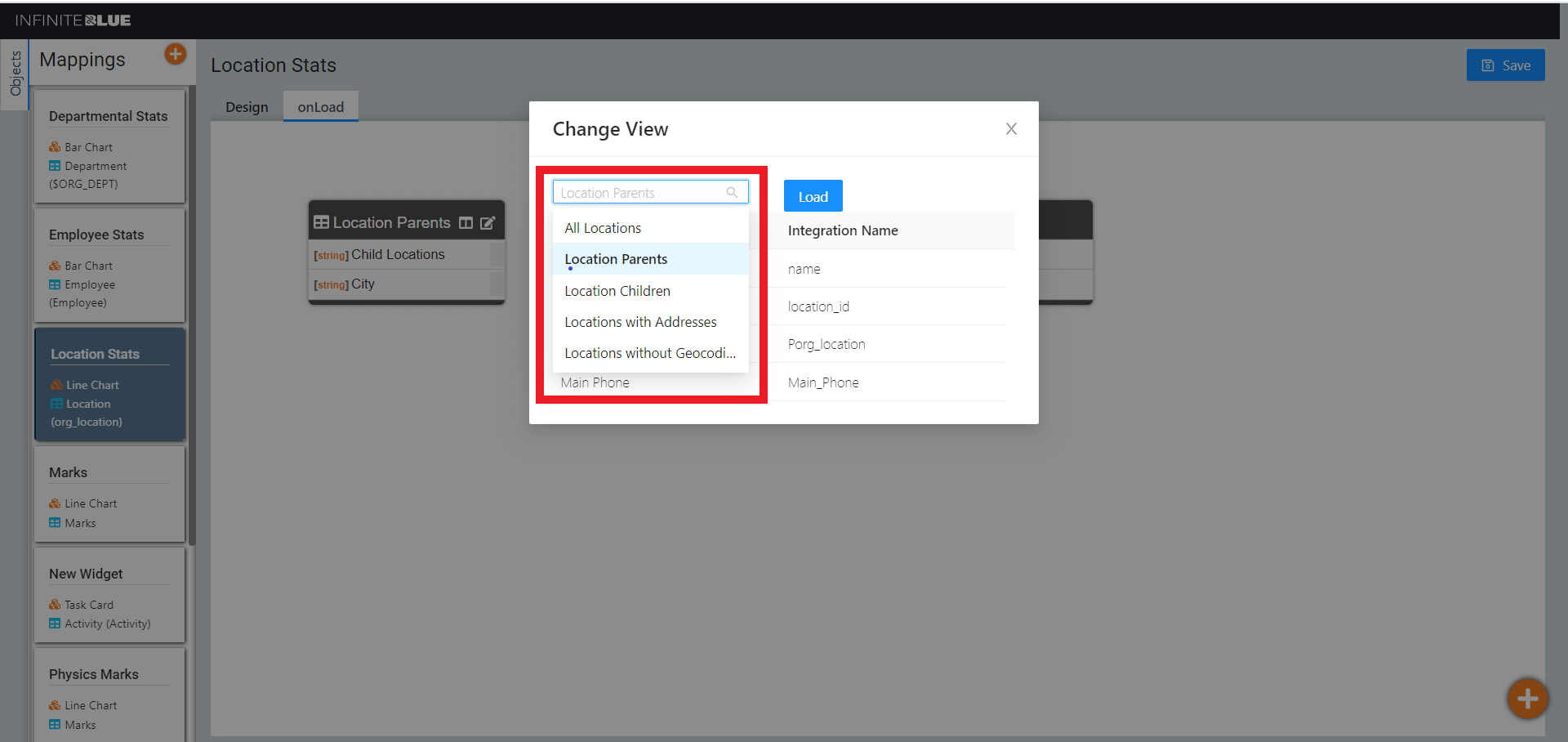
The field display names and their respective integration names appear once a view is selected. Click Load after you finalize a view.
Note: Once a view is selected(loaded), all existing mappings are lost.
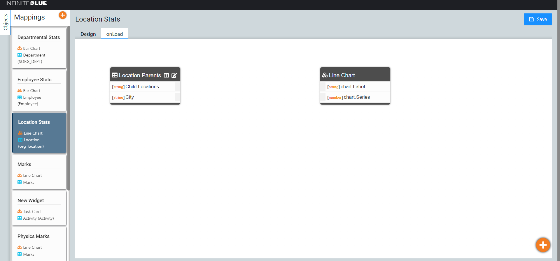
Selected Fields
If you wish to display certain fields of a view , and not all its fields, then this can be done by clicking the Selected Fields icon.
Note: By default, 10 fields are shown, which are configured with the selected view. This icon appears only if the number of fields is greater than 10.
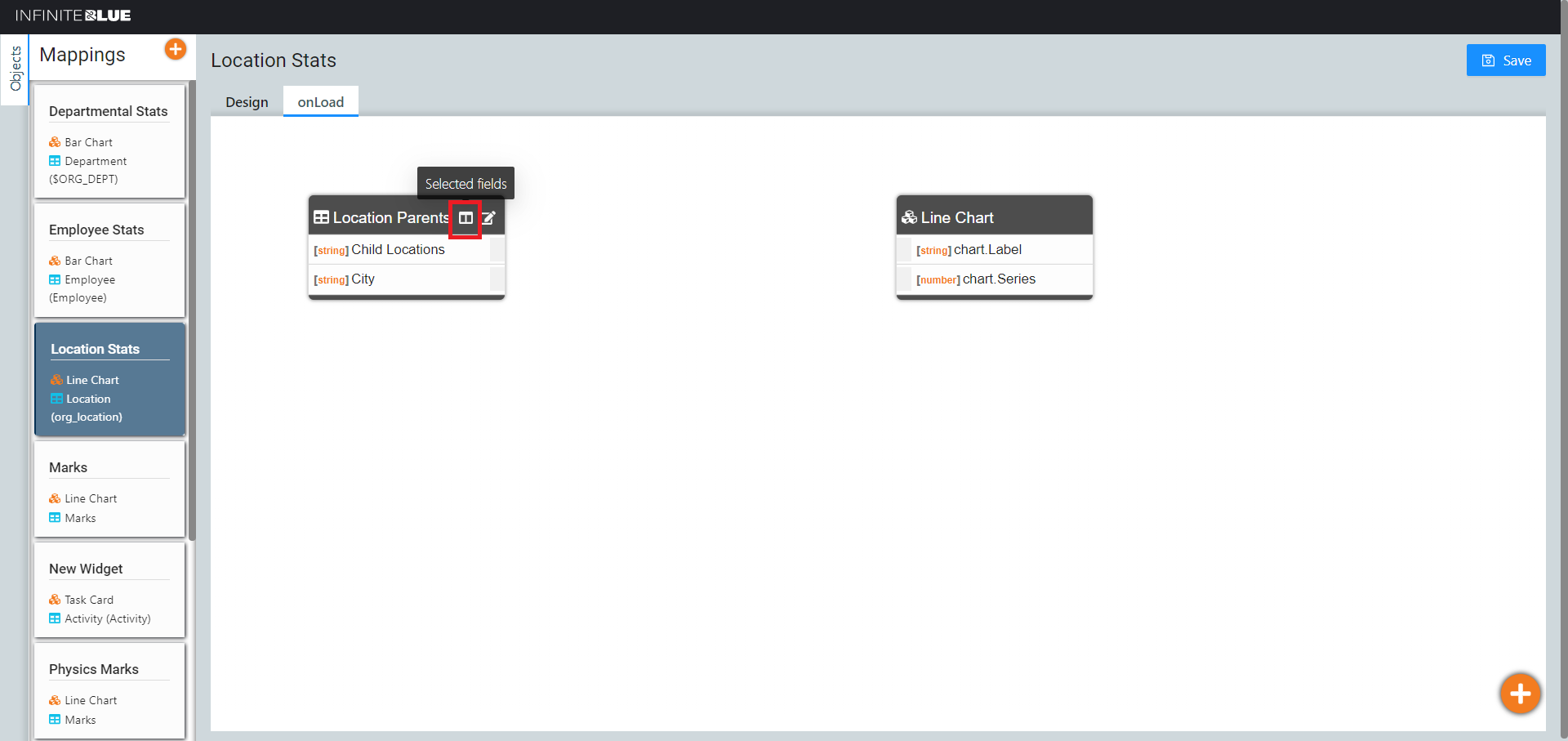
The list of fields available in the selected view appear. Select the fields you wish to display, and click the Selected Fields icon once again to save.
Note: You can left click and hold to drag the field list with 2 fingers on your touch-pad to be able to view the complete list.
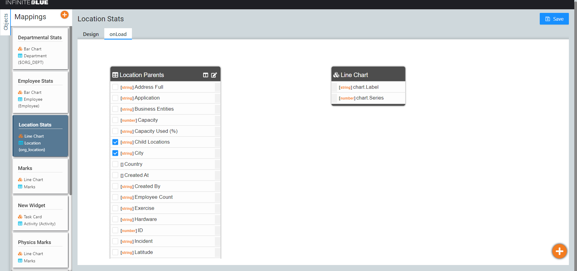
As a result, only the selected fields of the view appear. Map them as required.
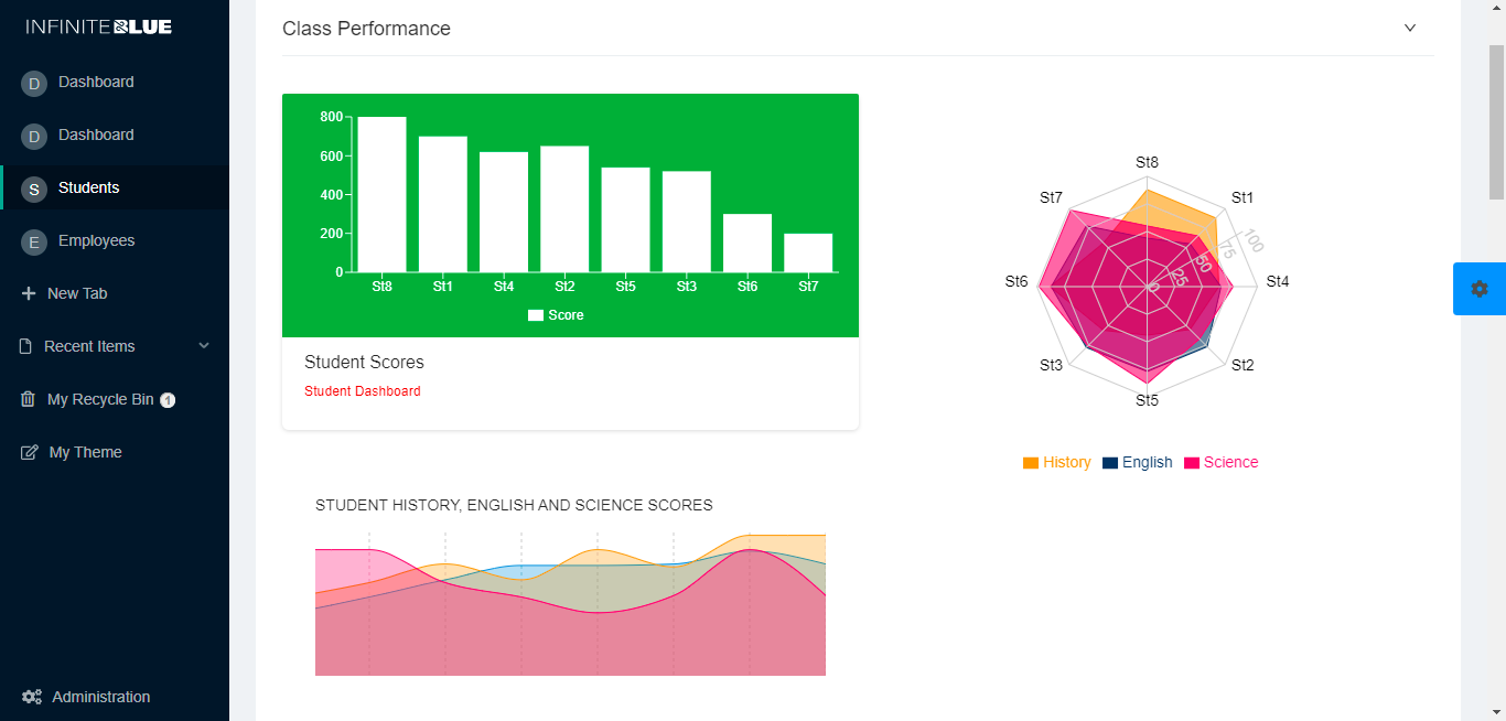
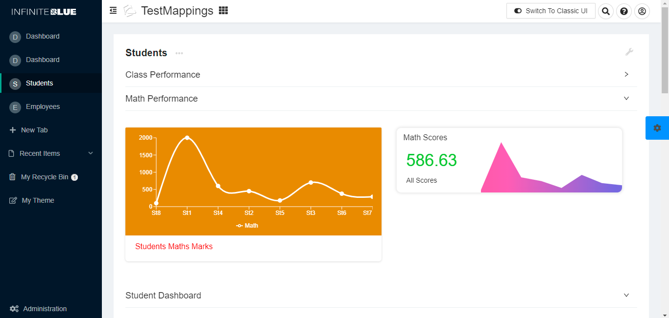
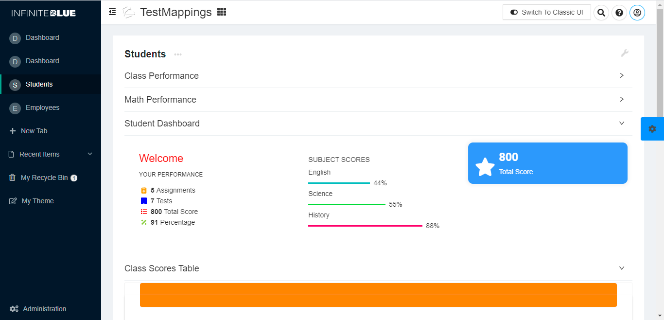
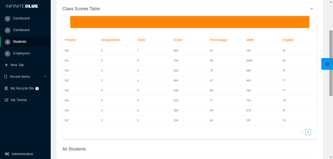
UI Widgets
Using this collection of intuitive and interactive widgets, stunning applications can be created effortlessly. The following images display some of the sample application pages using the UI widgets.